

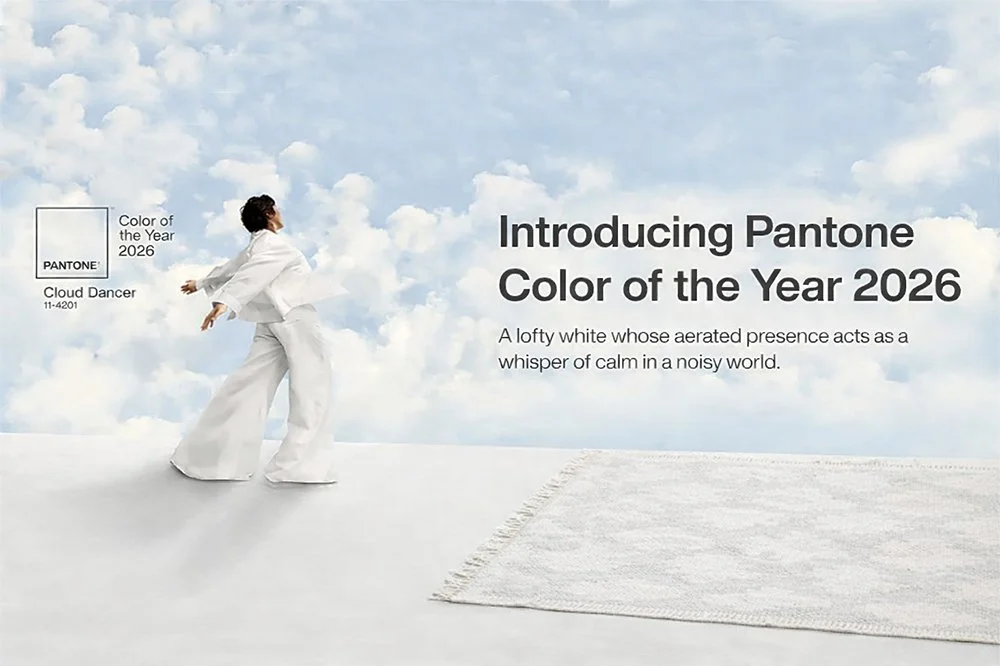
Pantone’s Color of the Year: Cloud Dancer White
Well… white is technically all of the colors. So there’s that.
On paper (literally), white works. It plays well with warmer tones, softens bold choices, and blends nicely with greens, wood finishes, and natural textures. Used thoughtfully, it can feel calm rather than clinical. Creating an “effortless backdrop” more so than the feeling of “staring into the void.”
But we need to address the elephant in the (very white) room.
If you follow design trends at all, you’ve probably seen what’s been circulating on social media about Pantone’s Color of the Year. And it begs the question: where are we as a society if this is what’s steering our design future for 2026?
The commentary has ranged from:
comical (“Did they just… give up?”)

to frustrated
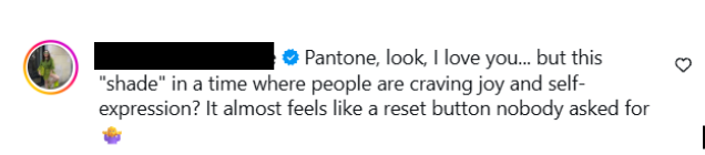
to downright suspicious (“Is this a social experiment?”)
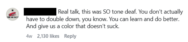
And honestly? Fair.
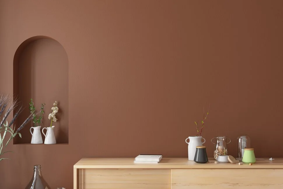
Historically speaking, and anyone familiar with color theory will back me up here, white is the combination of every color. It’s everything and nothing all at once. Over the past few years, especially in kitchens, we’ve seen a major shift toward personalization and individualization. People moved away from stark, builder-grade white and toward warmer, softer whites—or abandoned white altogether in favor of color, texture, and mood.
So maybe, maybe, choosing white is meant to symbolize inclusivity. A “choose your own adventure” approach. By embracing white, are we embracing every color? Every person? Every aesthetic?
Last year, Pantone selected the color Mocha Mousse. While that color had its own, milder discourse, that color made its way into everything from home design to fashion. So, going from a shade that leaned into warmth, individuality, and emotional impact straight into white feels less like an evolution and more like a record scratch. Did we collectively need a breather? Did Pantone decide we were getting a little too bold and needed to sit down?
Or… are we just playing it very, very safe? And in doing so, have they created the very controversy they were trying to avoid?
Because here’s the thing: this is happening at a time when white kitchens are becoming outdated. The once-coveted all-white kitchen is fading into the background, replaced by rich woods, moody hues, mixed metals, and spaces that actually look like someone lives there. White, once the main character, is now more of a supporting role.
Which brings me to a point that was best made by one of our designers. She had a job in her 20s where she was required to wear a crisp, button-up white shirt. To this day, she cannot—will not—wear a button-up white shirt. It was pushed on her, and maybe that’s why she’ll always see white best used as an accent, not the main event. A supporting actor, not the star of the show.
Ultimately, white isn’t bad. It’s just… complicated. It can be beautiful, grounding, and timeless when used with intention. But crowning it Color of the Year feels less like a bold design statement and more akin to a shrug.
So what do you think?
Is Pantone ahead of their time, quietly predicting a return to neutrality in a loud world?
Or are they getting a little lazy?
From the comical to the confused or even frustrated, white has definitely sparked conversation. And maybe that, more than the color itself, is the point.